This story begins like many others: someone, the A&C (Ambassador & Community) team, has a great idea to impress our community, so they come to us asking for feasibility. They would love to have a “Spotify Wrapped” for our Coordinators, where they can see community-wise numbers and personal statistics, like number of coordinated tours, pax met, days spent traveling and many more.
«That’s cool, when would you like to release it?»
«September» – we’re in mid-August.
«Ok, not cool anymore. We don’t have time, but start gathering ideas.»
With our pipeline already full and team that recently became smaller, plus the summer holidays, that was not a lie, at least not this time. But if we don’t have free engineers for a non-critical business product, we have AI and Agents, why not giving it a shot?
💫 If you’re into vibe-coding, a geek that always wants to know more and loves the whole LLMs topic, do you fancy joining us?
With Cursor open in the frontend project, a simple prompt and lot of hopes:
Create a Spotify-wrapped like component that shows the authenticated user scrolling stories with some data of them of the past year. Our users are “travel coordinators” leading tours in specific travels and destinations.
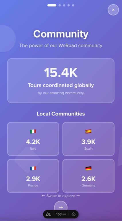
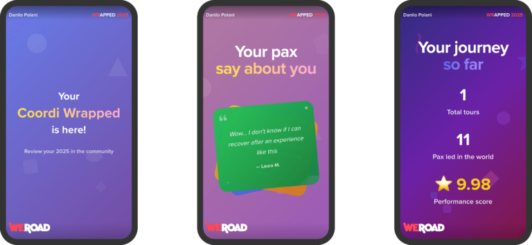
I want to show in the first slide: Community
- Number of total global tours done by the community
- Number of total local community tours done by the community (divided in Italy, Spain, France, Germany),
Second slide: Your year in a glimpse
- You’ve coordinated {N} tours,
- You’ve spent {N} days on tour in the past 12 months -> New line: That’s {N} minutes!,
Third slide: …
Make stunning visual such as Spotify Wrapped, animations, shapes, strong colors, they must say “Wow that’s so fucking cool”
UI
I was not satisfied with the UI taste of ChatGPT-5 and Claude Sonnet 4, so I switched to v0 with the same prompt and tweaking there and the results were definitely better, so I’m just going to continue using that UI, written in React, and asking Cursor to read it and adapt it to Vue while using the same color palettes and concepts.
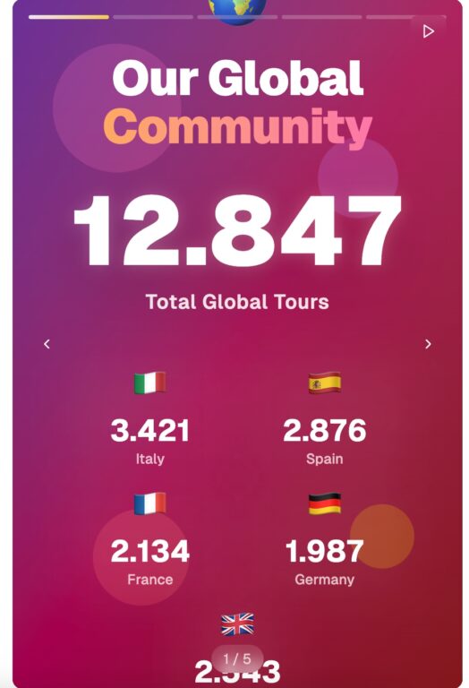
I LOVED the title – the “Community” word has a shimmer gradient animation – and the colors. Now the fixes inspired by the v0 version:
- It’s too static, add some animated shapes in the background. At least we don’t have just a gradient. The Spotify version, being minimalist, uses a flat design color system, but we’re good with the gradient for time being.
- The sliders at top must be Instagram-like, more wide and taking 100% of the horizontal space. The close icon must not have a circle background.
- No card on values, more flat design and remove the text shadows.
- Add our logo at top-left with a soft gradient to make it always visibile and some action icons at top-right. We’re going to work on these later.
When I needed to add new slides following the same pattern of the other ones, both ChatGPT 5 and Claude Sonnet 4 demonstrated to have almost no UI taste in color palettes and therefore every new slide has been generated in v0 and with the same instructions as above, passed to Cursor to adapt them.
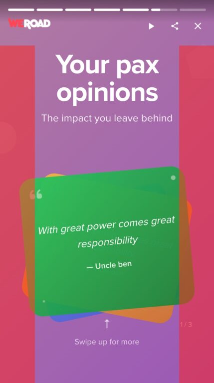
The hardest slide to make is the one about our pax reviews’: it involved swiping up to change the feedback, making it work with left and right swipe and most importantly – where I spent most of the time switching LLM – a smooth animation on card change. I’ve been on that probably 30 minutes with fixes, retries and fails.

UX & Functionalities
- Show the buttons to change slide only on desktop, on mobile users can swipe left and right to change story. On desktop users can still click the arrow buttons or use the physical arrows on their keyboard.
- Add a auto-scroll feature. Like Instagram Stories we like to give users time to read but also not to swipe every time. This was, for some reason, complex for the AI to achieve. Claude Sonnet 4 started to implement it but the indicator at top were clunky, sometimes they were going backwards instead of forward, animations ran twice and many other problems. Switching over ChatGPT 5 solved lot of these issues. Lesson: if a model can’t do it in two tries, switch it.
- Mobile users can change slide by tapping left and right. Although simple, remember that we have the “reviews swipe-up” slide, so we needed a “safe area” at the center of the screen to not overlap with that.
- Mobile users can temporarily pause the slide by tap-holding, and it resumes as soon as they release the tap. We’re all used to Instagram stories, we know how to use it and would be crazy to provide a different experience. On desktop you can still pause your Wrapped with the spacebar or the button at top-right. Again, this could create issues with the “swipe up”, so the AI implemented it so that if intercepts a tap movement of at least 10px it assumes that the user is swiping and resumes the slide.
Sharing slides
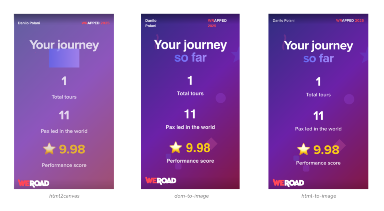
What’s the most important feature on Spotify Wrapped? The ability to share it with your friends and put it in your Stories, but we don’t have to render the slides backend side to generate images to download, so we have to rely on a client-only solution.
The first iteration of AI by integrating the html2canvas library was so close to our desire, but there were some artifacts due to SVG and the background was not keeping our shapes. I later found out later that a html2canvas-pro library exist, but the result was the same.
Second try: dom-to-image-more, a more advanced version of dom-to-image. It keeps the background intact, but fonts are off as well as the overall quality.
Some Googling about libraries, Reddit threads and that’s the perfect, final, library: html-to-image. The code integration was done all by AI of course and worked smoothly, we just need now to hide some unnecessary UI elements such as the slide indicators and actions at top when “screenshotting”, and the package has a built-in method to achieve it.
Other necessary changes: the shimmer effect creates every time a different effect – because you don’t know when hitting the download button where the effect is in the title, so we must get rid of it.
We also want to show additional information such as the Coordinator name and move some elements and there, so we added a overlay while downloading so the user doesn’t see these temporarily changes. For example, at beginning our logo was on top left and of the same size, but would be covered by the user name in a Instagram story.
Inspired by Spotify we moved it on the bottom and make it bigger. No link on the right for us, that’s our brand identity.
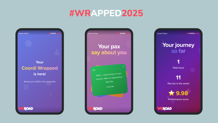
Final result
This is just a small preview of what we’ve achieved in these two days, but why not becoming a Travel Coordinator to discover your personal #WRAPPED2025?